Color plays a pivotal role in shaping our experiences and emotions, often influencing us in subtle yet profound ways. In the dynamic world of restaurant and bar design, understanding the psychology of color is essential for creating environments that not only attract customers but also enhance their dining experience. From the appetite-stimulating hues of red and orange to the calming effects of green and blue, the strategic use of color can transform a space, evoking specific feelings and behaviors. Go through the following color list and explore the fascinating interplay between color and psychology, and how restaurateurs and bar owners can harness the power of color to create compelling and successful dining atmospheres.
Red: This color is associated with energy, passion, and excitement. It can stimulate appetite and encourage social interaction. However, excessive use of red may be overwhelming, so it’s often used as an accent color or in specific areas.
Yellow: Yellow is cheerful and optimistic. It can evoke feelings of happiness and warmth. In restaurants, it’s often used to create a welcoming atmosphere. However, bright yellow might be too intense, so softer shades or accents are commonly employed.
Green: Green is linked to nature, freshness, and tranquility. It can promote relaxation and a sense of well-being. In restaurant design, green is often used in spaces where diners are expected to linger, such as waiting areas.
Blue: Blue is calming and soothing. It’s associated with trust and professionalism. In restaurant and bar design, blue can be used to create a serene ambiance, especially in fine dining or upscale settings.
Orange: Orange is energetic and vibrant. It can stimulate appetite and create a lively, social atmosphere. It’s often used in fast-casual dining establishments or places where quick turnover is desired.
Purple: Purple is associated with luxury, creativity, and elegance. Deep purples can create a sense of opulence, making them suitable for upscale dining environments.
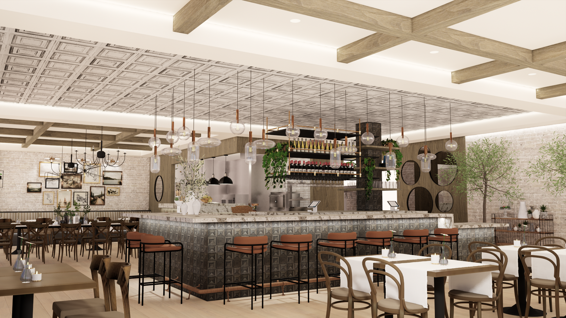
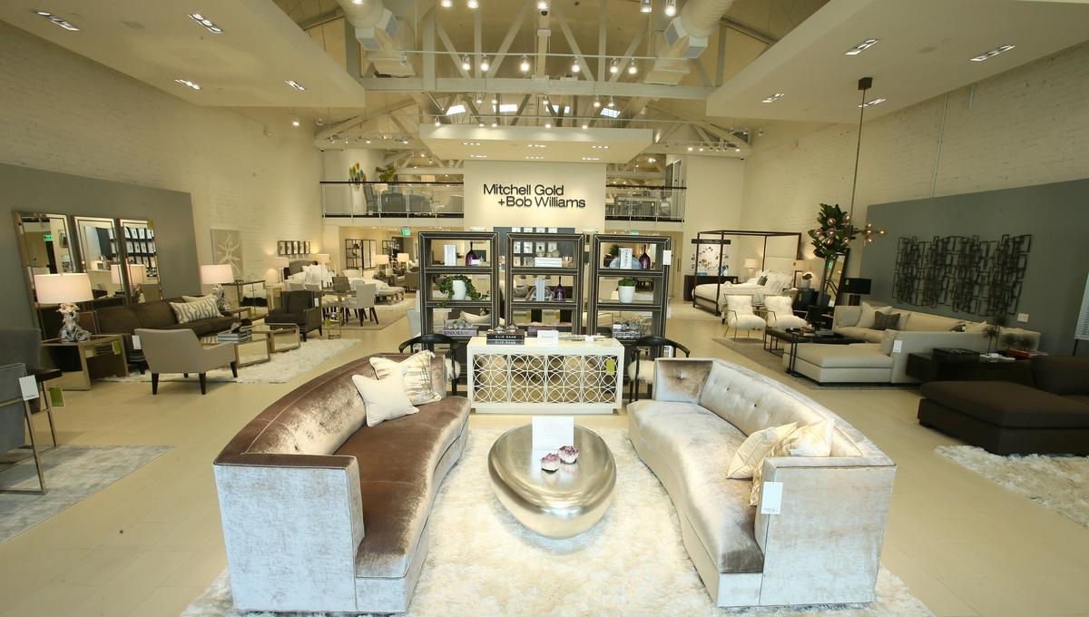
Neutral Tones (Beige, Gray, Brown): Neutral colors can create a clean and sophisticated look. They’re often used as base colors to complement other hues and allow food and decor to take center stage.
Black: Black is sophisticated and timeless. It can create a sense of drama and formality. However, too much black can be overwhelming, so it’s often used in combination with other colors.
White: White is associated with cleanliness and simplicity. It can create an airy and open feel. However, an all-white space might lack warmth, so it’s often paired with other colors or textures.
Multicolored Palettes: Some restaurants and bars use a mix of colors to create a vibrant and eclectic atmosphere. These spaces can feel energetic and lively, appealing to a younger and more adventurous crowd.